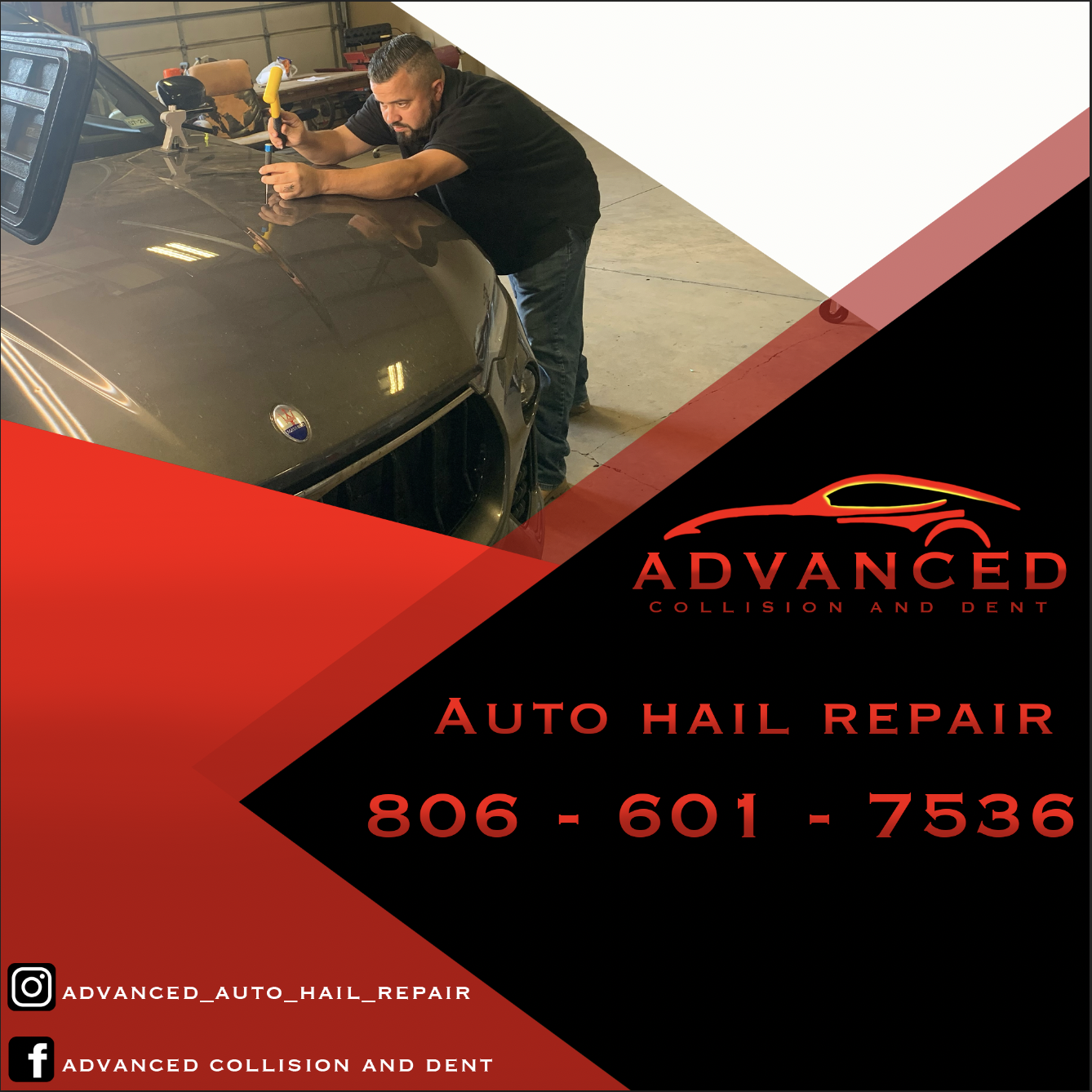
This project was for a company, Advanced Collision and Dent, to create a social post.

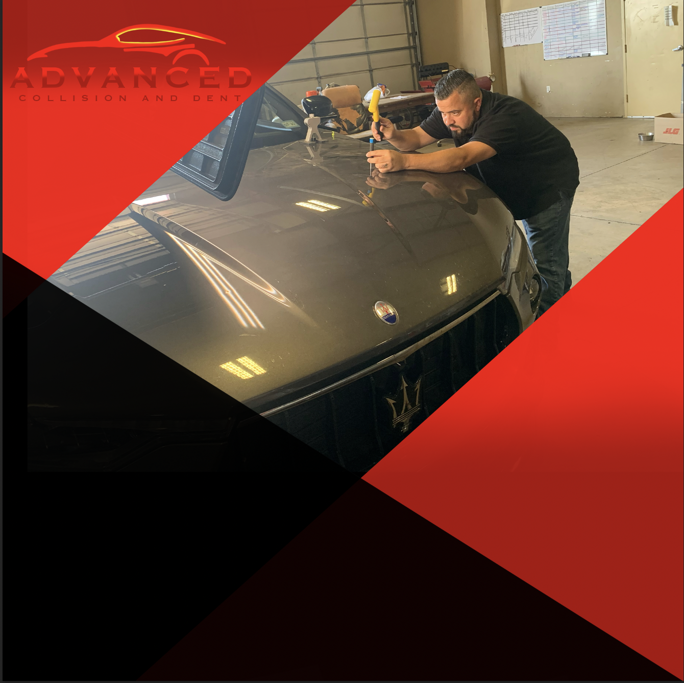
The first concept of the design serves as a starting point, I was coming up with how the placement of everything should be. Deciding on what colors should go where and which shpaes I wanted to use to design this post. This concept was used to lay down the foundation for subsequent stages of the design process.

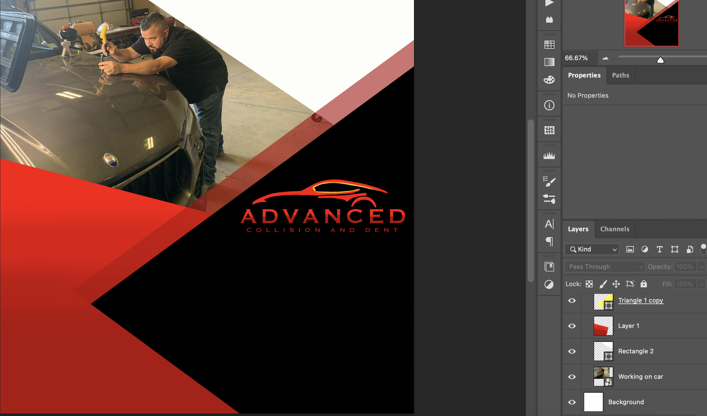
For the redesign, I rearranged the colors to adapt based on the feedback I received from the client. Adjusting and refining the work to better align with the client's vision and brand identity. I assessed how the new arrangement of colors would interest with the other elements in the logo and overall design. I aimed to creat a harmonious and balanced composition that would catch the attention of viewers and effectively communicate the brand message. I positioned and arranged the text to be readable in the design. I made sure that the font choices and typography style aligned with Advanced Collision and Dent's established brand identity. I focused on presenting the message the way the client wanted clearly and concisely. I positioned and arranged the text to be readable in the design. I paid attention to the overall visual balance of the design. This involved distributing the text elements proportionally and considering the negative space to create a harmonious composition that is visually pleasing.

By considering these factors and collaborating with the client. I made informed decisions about the color changes in the redesign stage. Utimately, the gaol was to create a visually appealing, memorable, and impactful design that accurately represented Advanced Collision and Dent's brand identity and effectively communicated Advanced Collision and Dent's message.
