This project was for a company, BlueBerry Cosmetics, to create a logo design.

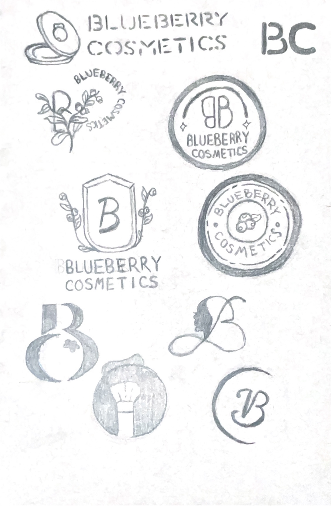
To generate ideas, I began the design process by sketching approximately 50 logo concepts. These initial sketches allowed me to explore a wide range of design directions, visual elements, and typography choices. Experimenting with different approaches and allowing me to have creativity throughout these sketches. After the sketching phase, I narrowed down the options to a few promising concepts. I then presented these concepts for feedback and discussion. Through collaborative dialogue, I identified the concept that best resonated with the client’s brand identity and objectives.

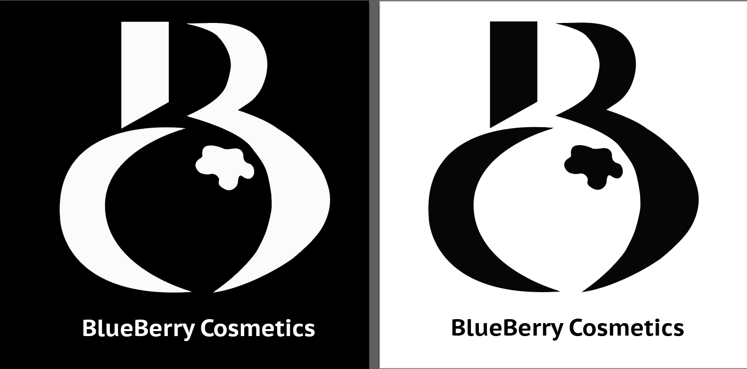
With the selected concept, I moved into the refinement and iteration stage. I translated the sketch into digital format, paying attention to precision and proportion. I explored different variations of the letter “B”, experimenting with different shapes, sizes, and positions. Colors play a crucial role in cosmetics branding. Considering this, I explored various color palettes to find the right balance for BlueBerry Cosmetics. After considering different options, I settled on a combination of blue and yellow. Blue symbolizes trust, reliability, and calmness, while yellow represents energy, happiness, and creativity.
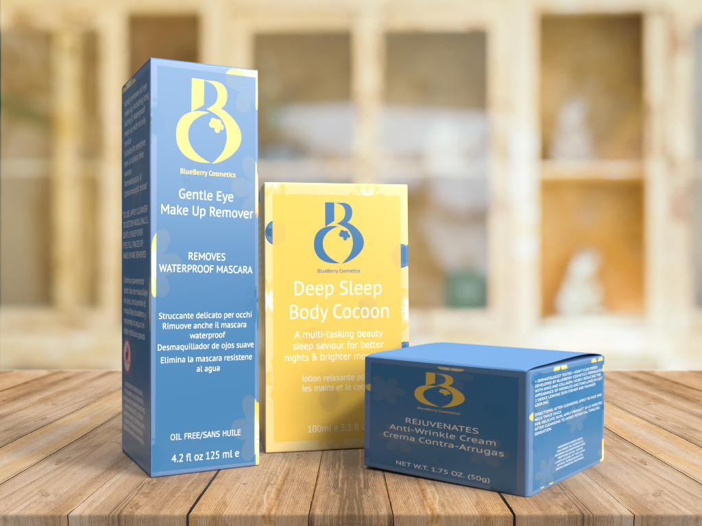
After incorporating feedback and making necessary refinements, I arrived at the final logo design. To showcase the versatility of the logo, I present it in various contexts. This includes displaying the finished log on cosmetic product packaging. Demonstrating how the logo translated across different mediums and highlighting its visual impact and adaptability.
